There are quite a few layout components which use full-screen elements, not only overlays. Another use-case are intro- or landing pages with different sections, where each section has the minimum height of the browser window, often in combination with parallax scrolling effects. Making an element fill the visible screen height via CSS sounds simple, but there are more pitfalls than you might think, especially when you deal with mobile browsers.
But before digging deeper, if there are pitfalls within the CSS solution, why not using JavaScript to calculate and manipulate the dimensions of these full-screen elements? In most of the cases you require JavaScript anyway, so why bother?
If you’ve ever attached an event handler to the window’s resize event, you have probably noticed that while Firefox fires the event slow and sensibly, IE and Webkit go totally spastic.
Paul Irish – Debounced Resize
.
The resize event is notorious for being triggered at a high rate per second, the complete page might start to lag. On top on this, since some devices/ browsers do not trigger the resize event when you turn it, you also need to listen to orientation changes. You might argue that calculating a dimension isn’t really performance-intensive and there is also the option of debouncing / throttling the event. You are right, but here is another one: Not every device fires the two mentioned events in the same order, nor at the same time. For further details, have a look at the article of Philippe Masset. With this in mind, and a focus on slower mobile devices, it might be helpful to look for a simple solution to solve this task. Therefore this review of CSS based solutions targeting the fullscreen element.
The 100% approach
This is a classic: If you try to set the height of an element by using height:100%; to fit the window height it doesn’t work out of the box. Why? – Because the percentage (%) is a relative unit, therefore the element height depends on the height of its parent element(s). Depending on your HTML structure there might be more, but the very first two parents are always html and body. Using percentage values, both elements need a height declaration.
html, body {
  /* reset default inner and outer space to avoid oversizing */
  margin: 0;
  padding: 0;
  height: 100%;
}

.fullscreen {
  height: 100%;
}
The pitfalls for percentage
Adapting height:100% to the html and body element, prevents the body from expanding with its contents once they start to grow beyond the viewport height. Technically this doesn’t prevent the content from scrolling, but it does cause the body element to leave a gap beneath the fold, which is usually undesirable. For example if you define a background color (or image) for body and html, the background for body will stop at the initial viewport height.
Switching to min-height on the body is not an option, because as soon as you remove the 100% height, the child (fullscreen) element won’t stretch to the window height. Even if the specifications might be interpreted differently as Roger Johansson pointed out in his article, no major browser stretches the child element.
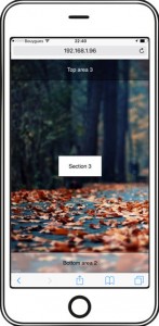
Not to forget, using height:100%; for elements create another issue on various mobile devices. While scrolling the page, the one hundred percent height does not cover the full screen. There is a gap (about 60 pixel) at the bottom (or on top as you see in the following screen-shots).
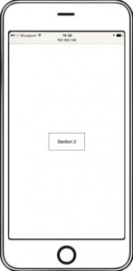
Screenshots from the 100% approach

Opening up the test page, everything looks fine, the fullscreen element with a top and bottom area fits the viewport
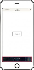
Scrolling to the next fullscreen section, you see the 60 pixel gap (red border) at the bottom, the elements do not fit the actual view-port height

Scrolling to the last fullscreen section, you see the 60 pixel gap (red border) at the top, just in case you continue scrolling even if you reached the end, this gap disappears.
The 100vh approach
In my post Fullscreen overlay, please!, I proposed the usage of the vh unit to get rid of the gap. At first glance the vh unit is a lot easier to use than the percentage unit. No matter how nested the element is, it is still able to be sized relative to the viewport dimensions. No parent dependencies, less CSS code, no gap. By using the vh unit, the CSS might look as clean and lean as this:
.fullscreen {
  height: 100vh;
}
The pitfalls for vh
On any recent desktop or laptop this works like charm, but when it comes down to mobile browsers, you will face a new problem. On the initial state (before scrolling) the fullscreen element is taller than the visible screen. Imagine you want to put your navigation on the bottom of a fullsize container with a hero element above, all you would see is the hero – no visible interaction – bad user experience.
The worst part of it is yet to come. Benjamin Poulain replied to a related webkit bug which has been set to resolved wontfix:
This is completely intentional. It took quite a bit of work on our part to achieve this effect. :)
The base problem is this: the visible area changes dynamically as you scroll. If we update the CSS viewport height accordingly, we need to update the layout during the scroll. Not only that looks like shit, but doing that at 60 FPS is practically impossible in most pages (60 FPS is the baseline framerate on iOS).
It is hard to show you the “looks like shit” part, but imagine as you scroll, the contents moves and what you want on screen is continuously shifting.
Dynamically updating the height was not working, we had a few choices: drop viewport units on iOS, match the document size like before iOS 8, use the small view size, use the large view size.
From the data we had, using the larger view size was the best compromise. Most website using viewport units were looking great most of the time
Nicolas Hoizey has researched the inconstancy of the vh unit in detail. In short, this behavior will not change, will not get fixed, it might even be, that chrome will follow the safari way.
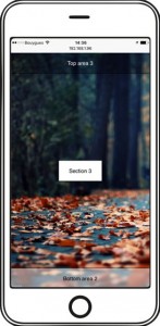
Screenshots from the 100vh approach

Opening up the test page, the bottom area of the first section is missing completely, in the moment you scroll, the bottom area is visible.
Scrolling to the next fullscreen section, everything as aspected, no gap, but as soon as you scroll up again, the viewport is to tall.
Same for the last element, no visible gap, everything in place, but as soon as you scroll up, the bottom section disappears.
Both approaches solve the task in the desktop world. The percentage variant supports a wider set of browsers (for example IE 10), but requires a simple DOM structure and could have side effects on the rendering of other elements. So the decision is mostly a question of the project requirements.
But as soon as it comes to mobile browsers neither the percentage nor the viewport unit works properly. And I do not talk about an old android phone or a rare tablet device. This is the current status for all recent iOS and android devices, phones or tablets. It is true, that many sites, themes and layouts avoid fullscreen elements on small devices (foremost phones) but lately I stumbled across quite a few of these on tablets. For example the current default wordpress theme (twentyseventeen), and all of them lost the struggle with a proper implementation.
A possible workaround
If it all comes down to the dynamic change of the viewport height, what if there is a way to get around this? The drawback of this solution is, that you’ll see the address- and toolbar permanently. For this you freeze html and body, disable scrolling, and wrap the complete content into a scrollable container.
html, body {
  margin: 0;
  padding: 0;
  height: 100%;
  overflow: hidden;
}

.wrapper {
  height: 100%;
  overflow: auto;
  /* enable smooth scrolling on iOS */
  -webkit-overflow-scrolling: touch;
}

.fullscreen {
  height: 100%;
}
Moving the scrolling from the body to a child element, suppresses the dynamic resize of the viewport, which caused the visible gap. All three sections behave as aspected.
Since the 100vh is per definition equal to the larger view size, you can’t use in this case. So back to the old school percentage and with a violation of the system UI/UX, because the workaround modifies the default browser behavior.
Screenshots from the workaround

Everything looks fine, except the fact, that the address- and button bar are always visible.
Last exit: Media-queries?
There are media-queries for all major mobile devices and media-queries do support orientation, so you could define a set of media-queries which contain a fixed pixel value for the fullscreen element. For sure, this is anything but an elegant solution. Thinking about all the different devices out there, it can be quite a list, you won’t get all of them and you will never finish the list either.
On the other hand queries for the ten most used devices might cover up to 80% percent of all page requests from mobile devices. Not perfect, but definitely better than ignoring the topic. You can find a long list of device specific media-queries at css-tricks. Here is an example how to set it up.
.fullscreen {
  height: 100vh;
}

/* ----------- iPad 1 and 2 ----------- */
/* Portrait */
@media only screen
  and (min-device-width: 768px)
  and (max-device-width: 1024px)
  and (orientation: portrait)
  and (-webkit-min-device-pixel-ratio: 1) {
     .fullscreen {
        height: 1024px;
     }
}

/* Landscape */
@media only screen
  and (min-device-width: 768px)
  and (max-device-width: 1024px)
  and (orientation: landscape)
  and (-webkit-min-device-pixel-ratio: 1) {
     .fullscreen {
        height: 728px;
     }
}
Sometimes frontend development can be really frustrating. A task that sounds so simple, and yet we are not even close to a proper straight forward solution. Some might go for the viewport variant, because the “missing” pixels do not contain any important information. Some might use the media-queries to fix this behavior for the majority and simply forget about the rest of the users. Some might use the scrolling box workaround, because this approach can also be helpful for other tricky tasks on mobile, even if this is a violation of the basic browser ui/ux. And some might use JavaScript, but mo matter what version you prefer, I think you are with me, when I say: Setting the fullscreen height for an element is still not solved, it is an open issue.